The Common Misconception
Imagine you walk into a store. The sign above the door is sleek and modern. But inside, the walls are painted a chaotic mix of neon colors, the music is too loud, and the staff is rude. Would you go back just because the sign outside looked nice? Probably not.
This is the exact problem many businesses face online.
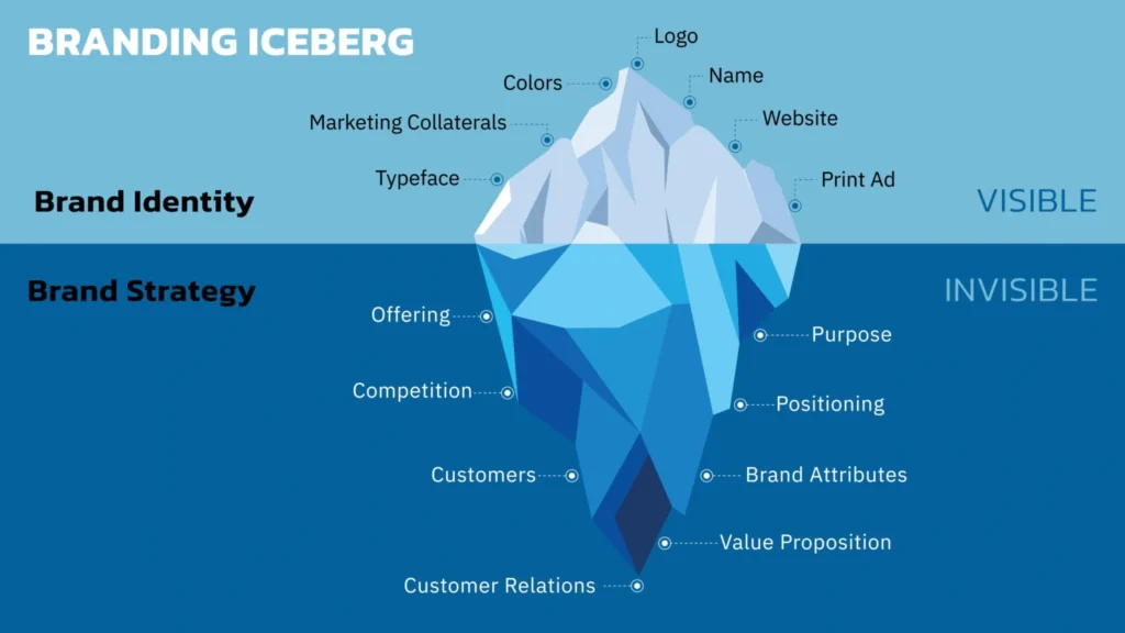
A common mistake we see at Xiphos Webcraft is business owners confusing a Logo with a Brand. They pay for a logo, slap it on a website, and assume the work is done. But a logo is just a symbol; a Brand is a reputation.

Without that foundation, your logo has nothing to stand on. A complete visual identity includes:
Color Palette: Colors evoke emotion. A medical site should use calming blues and whites (Trust), while a fast-food joint uses reds and yellows (Hunger/Urgency).
Typography: Are you using a classic Serif font (Professional, Traditional) or a bold Sans-Serif (Modern, Tech-focused)?
Imagery Style: Do you use high-end professional photography, or friendly, relatable illustrations?
Why Consistency = Revenue
The human brain loves patterns. We trust things that are predictable.
If your Instagram posts use neon green filters, but your website is dark and moody, you are breaking the pattern. This inconsistency subconsciously tells the customer: “This business is disorganized.”
When you work with a professional agency, we don’t just hand you a logo file. We create a Brand Guideline. This ensures that whether a customer sees your business card, your Facebook ad, or your website footer, they instantly recognize it as yours.
3 Signs You Need a Branding Refresh
You are embarrassed to hand out your business card because it doesn’t match your current website.
You use different versions of your logo (stretched, pixelated, or different colors) across different platforms.
Your customers don’t remember you. If you are just “another option” rather than a memorable experience, your branding is failing.


